ARTIST RESEARCH
|
|
|
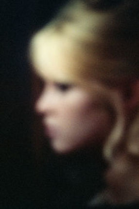
Fontaine is a French photographer who developed his passion for this from being a student in History of Art. His project was called 'Silenzio!' which came from a film reference where a character pronounces the word 'Silenzio'. This brings together the series of film images he used and his style of photography. Throughout 'Silenzio' he enjoyed mixing different genres of media and periods of time which influenced his work. The colouring was taken from 1940-1960's period which had particular tones which reflect that era. The artist explains his photographs to have a strange effect which is presented using old style of photography however finalised as very high quality film prints. These images are produced from digital screens and films screened on DVD which mixes all series of media and mediums throughout the project. The images are blurred and have an effect to them which is dream like, however still have elements of sharpness. The idea behind this was to not have a full image and not know where you are as if you have your eyes half closed with a hazy perspective. Fontaine claims to reintegrate and transform existing images through his own photographic style and aesthetic. He tries to make them something other than the originals, as if taken through a filter, using existing elements, reinventing them giving their own version of them.
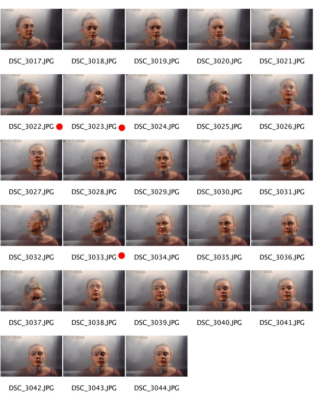
CONTACT SHEETS
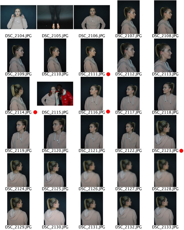
EDITS
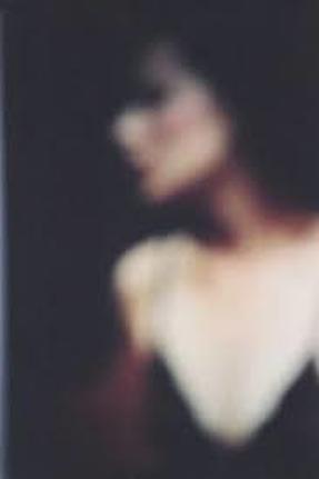
To capture the effect of the artists work i wanted to take elements of his images and create my own version of them. When carrying out this shoot i analysed the artists work and saw that he used portraits which are taken on dark, dim lit backgrounds which creates depth and silhouette, strong outlined images. I varied positions of my model which tried to capture unexpressive emotions and poses. I wanted the quality of the images to have the sharp crisp element so that once i was able to begin editing them in a way which reflects the artists style that i could keep the quality and could still make out the models features. Once i had taken the photographs i used photoshop to digitally edit the images. I upped the contrast and messed around with levels which gave the background more depth bringing the model forward and the main focus. I also used a 'Box Blur' which gave me that grainy, out of focus effect. I think these came out well as i tried to copy elements of his style however modernise and minimalize them using my own techniques and lighting effects to create my own version.
DEVELOPMENT - MARTA BEVACQUA
|
|
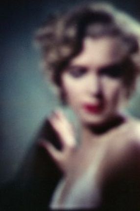
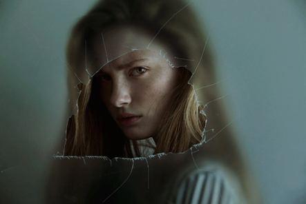
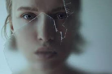
Marta Bevacqua photographs people through a ripped material which looks like tracing paper or hard plastic creating a blurred effect surrounding the image and then a clearer focus where the plastic is ripped away.
The style of photography she does is mainly portraiture using different materials to create a varied range of shoots. The saturation looks very low and uses muted tones keeping the images quite bland and dull with no outstanding colours to draw attention away from the detail. The tracing paper or material they have used creates dimension and texture around the high focused image. The images look well lit using either daylight with a plain backdrop. The work feels dull however it also looks like they are trapped behind the materials.
The style of photography she does is mainly portraiture using different materials to create a varied range of shoots. The saturation looks very low and uses muted tones keeping the images quite bland and dull with no outstanding colours to draw attention away from the detail. The tracing paper or material they have used creates dimension and texture around the high focused image. The images look well lit using either daylight with a plain backdrop. The work feels dull however it also looks like they are trapped behind the materials.
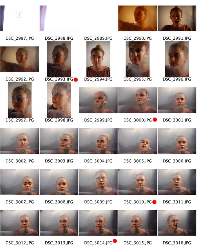
CONTACT SHEETS
|
|
Edits
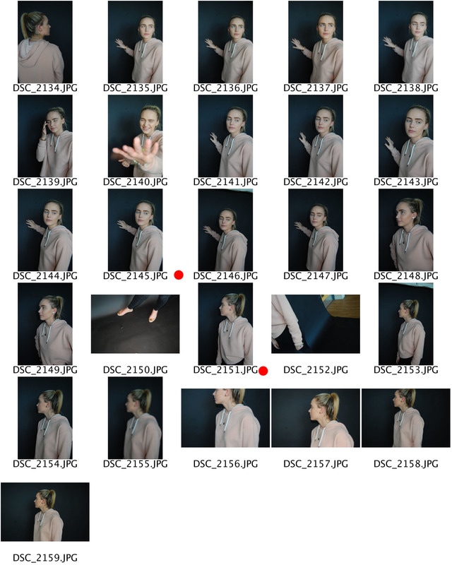
For this shoot to replicate the artists work we experimented with tracing paper however this technique didnt seem to give the effect we were looking for therefore we used a plastic portfolio and cut into that to create a peeled away effect. I think the level opacity worked better using this material as the tracing paper turnout out to be way to thick therefore you was not able to see her blurred figure coming through the paper. I also experimented with lighting as i needed her to be well lit however the background to hazy and plain. I think these came out well as they represent the artist work but also how my own style and twist to the images. I varied the models position and the distance between her and the camera to give a wide range of compositions which all work and amalgamate having the same technique.
